Heathrow and the London 2012 Olympics report
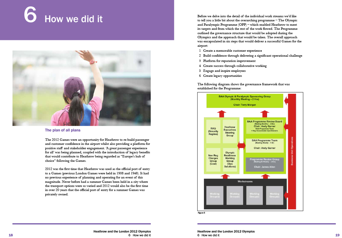
Creation of charts placed in a report for Heathrow airport following style guidelines.


Accessible
The report needed to be accessible to a wide range of stakeholders.
Attractive
This report needed to be attractive to reflect the nature of the information within it.
Brand
This report needed to fit into the Heathrow branding.
Conclusion
This was a fairly straightforward report, that was fun to work on thanks to the bold branding guidelines Heathrow have.
I would have liked to update the charts in the report, but this was not part of the brief, therefore time constraints did not allow this.