Intranet redesign
Redesign of existing intranet to improve stakeholder engagement.


Accessible
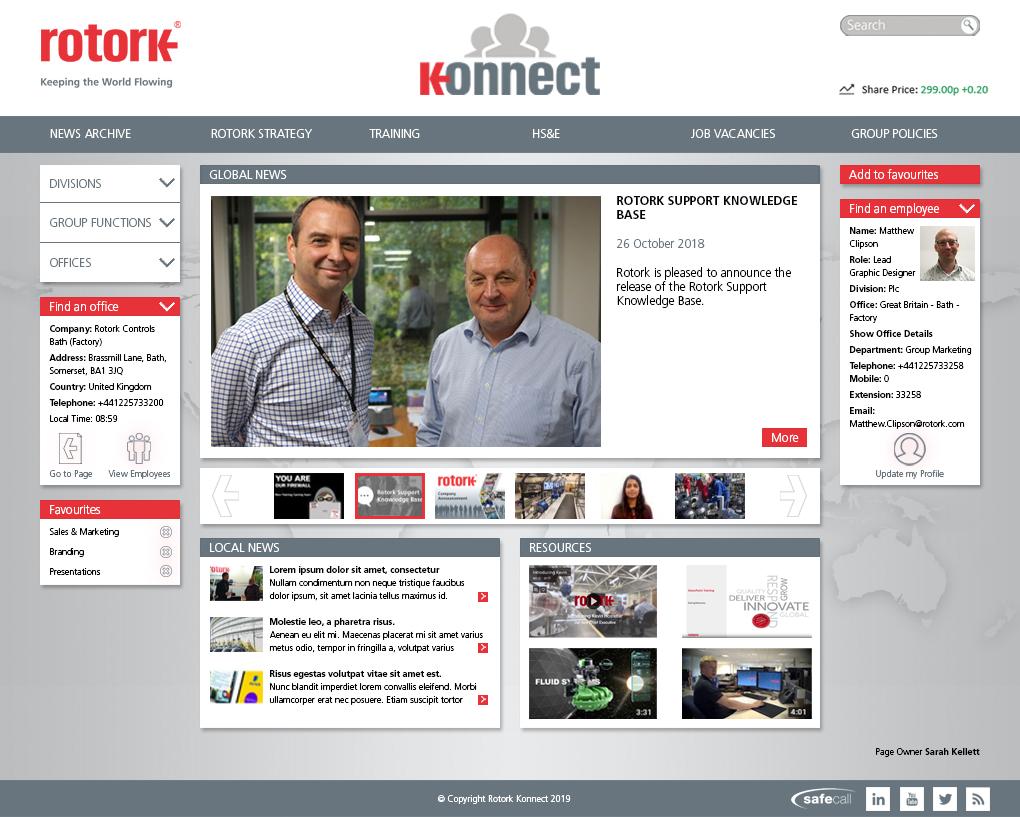
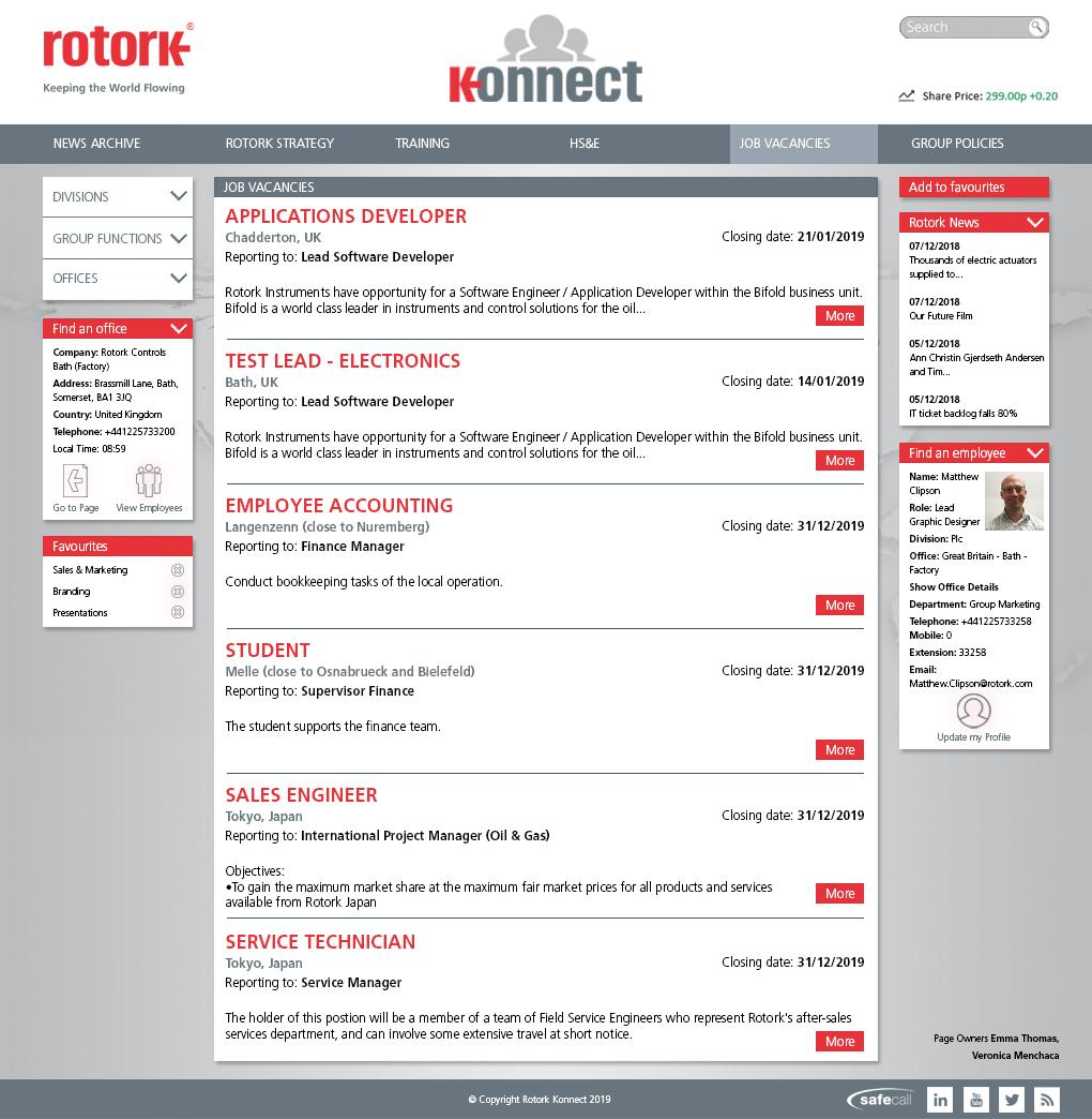
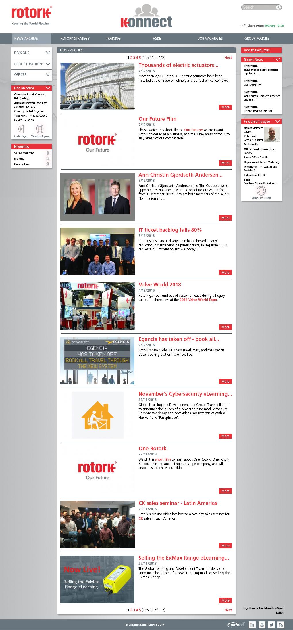
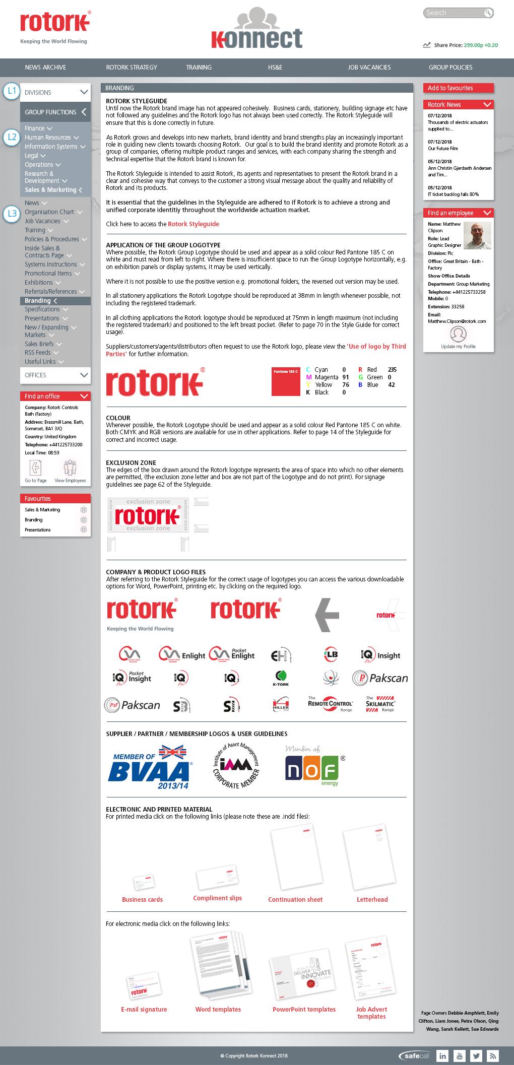
The redesigned intranet needed to be easy to read and understand where to find relevant information.
Brand
The intranet colour scheme needed to be fit in to the Rotork branding guidelines.
Attractive
The redesigned intranet needed to look more attractive than the previous version, in order to improve stakeholder engagement.
Conclusion
This redesign was much improved (I wish I had screen grabs of the original to show you!).