Fortis Property Services logo
The owner of Fortis Property Services asked me to provide a new logo design and an updated design of his existing logo.
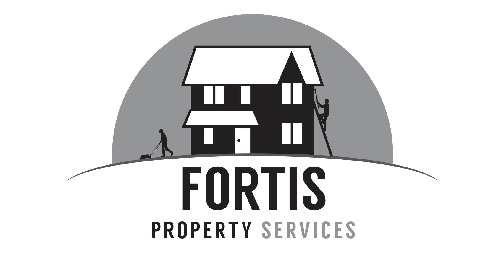
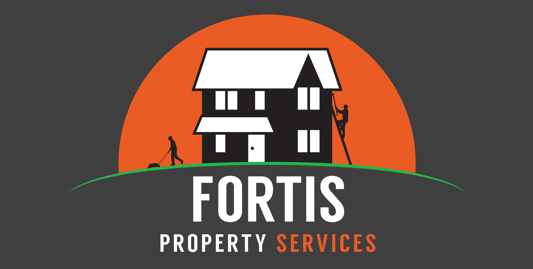
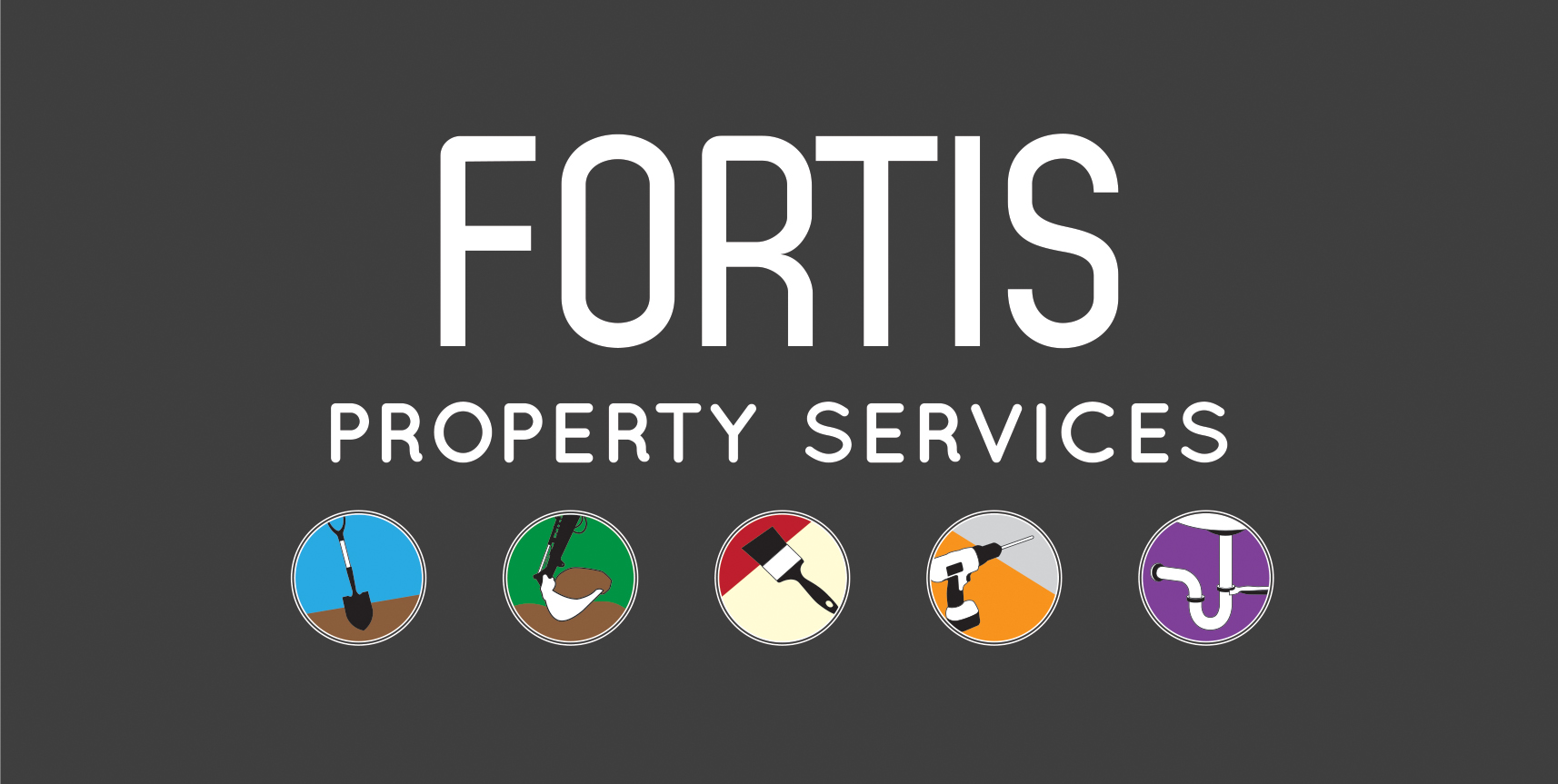
Final updated design
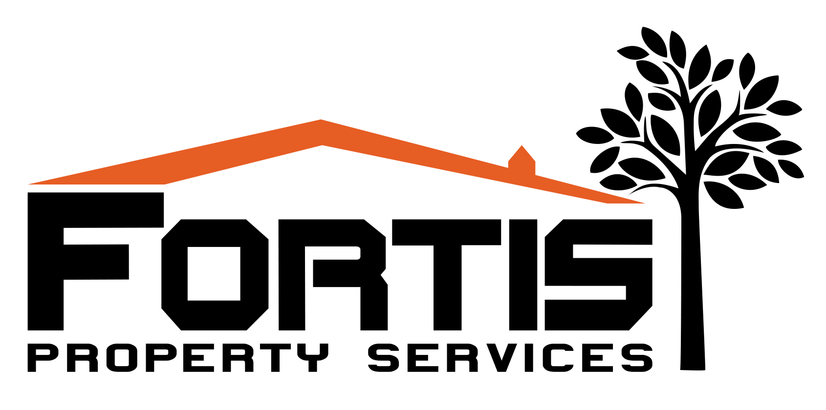
Colour logo
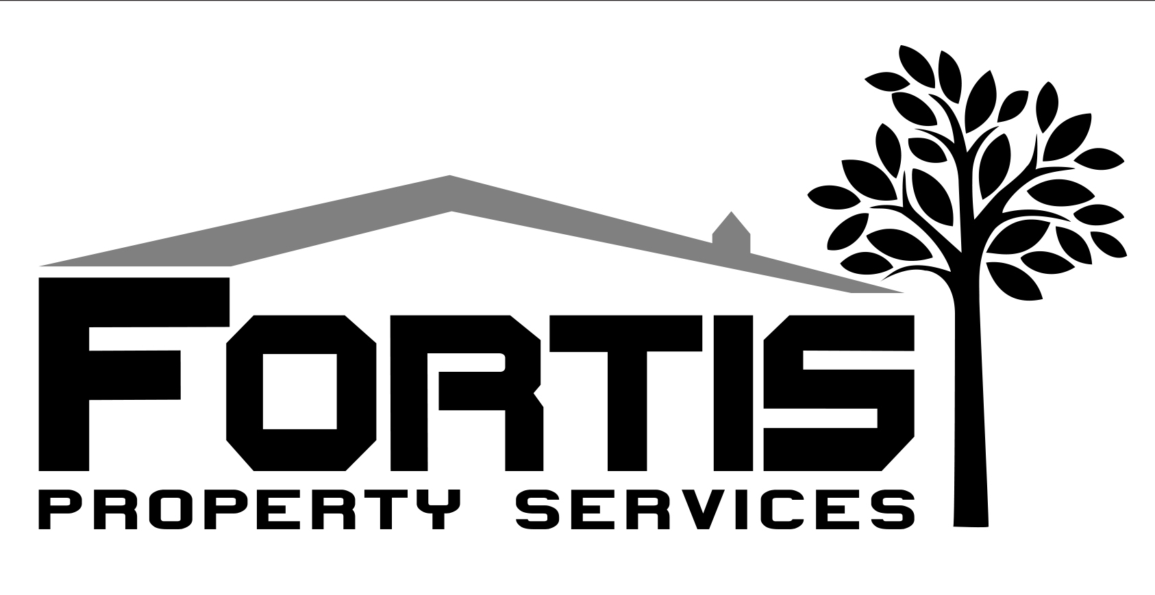
Black & white logo
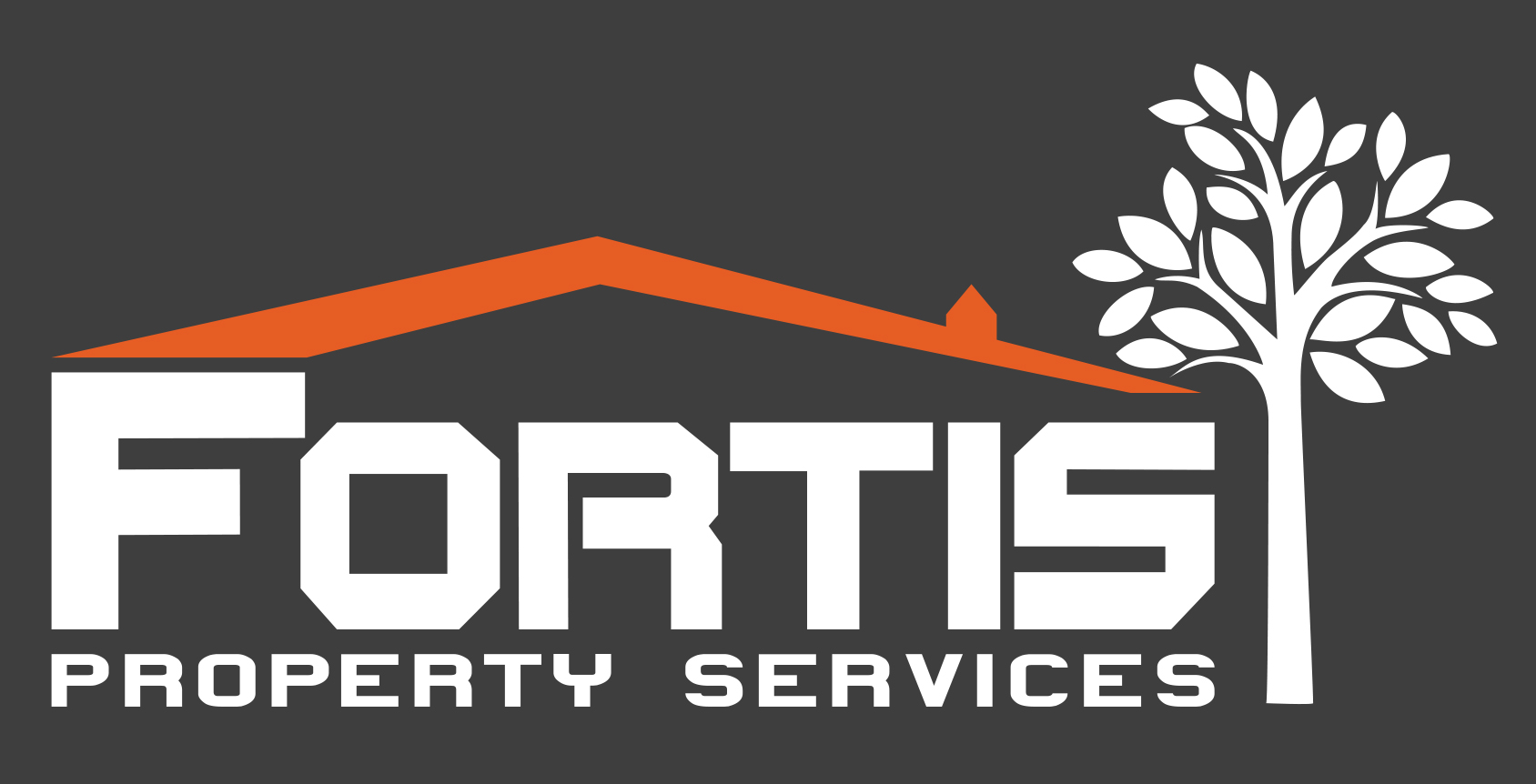
Reversed colour logo – to be used on website
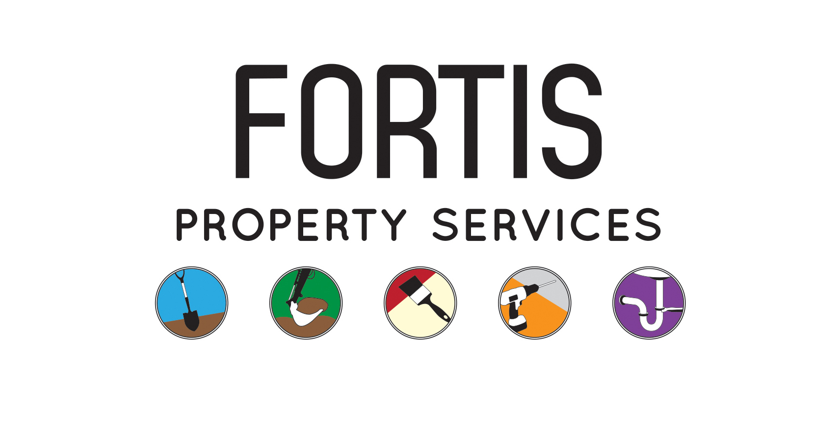
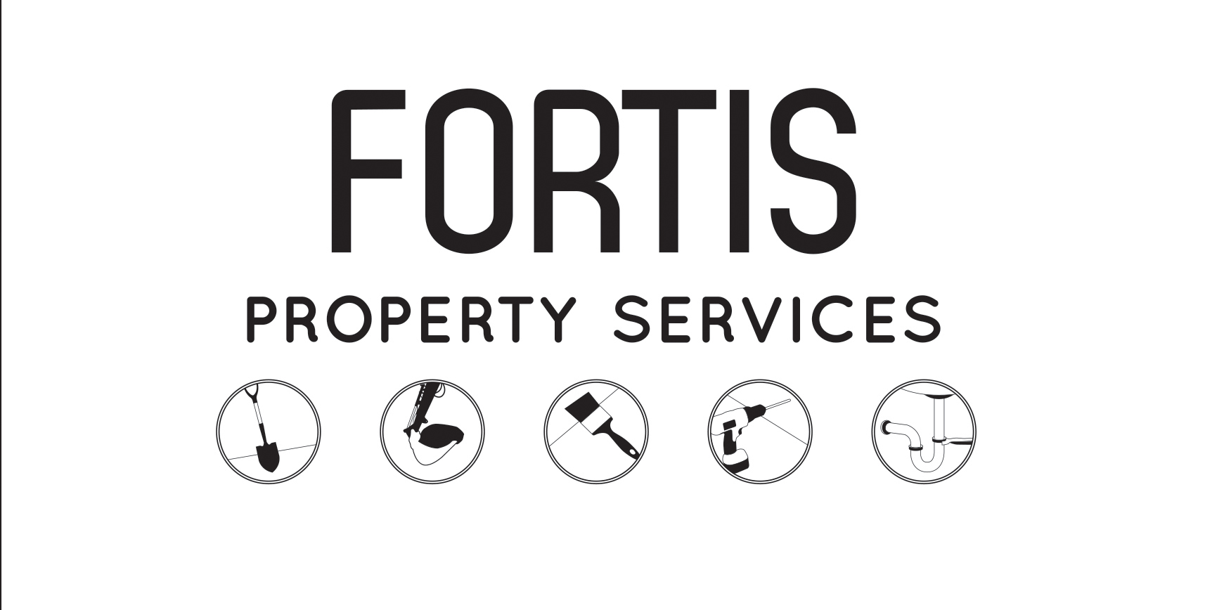
My preferred design
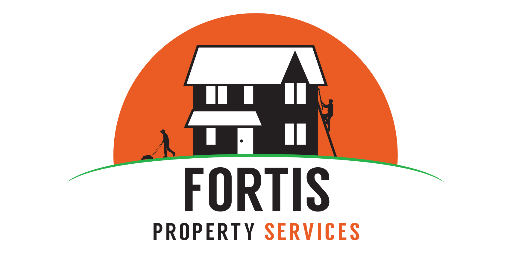
Colour logo
Black & white logo
Reversed colour logo – to be used on website
Alternative design
Colour logo
Black & white logo
Reversed colour logo – to be used on website
Brand
The logo design had to use the colours Fortis Property Services had chosen for their branding.
Uncomplicated
The logo needed to be simple enough to work at all sizes from the side of a van to Twitter.
Dynamic
The logo needed to convey Fortis Property Services level of professionalism and commitment to their customers.
Conclusion
Despite Fortis Property Services approaching me to design a new logo, in the end they wanted a tidied up version of their existing logo. In many ways this is a shame, because I feel my design was more dynamic and better conveyed the services they offer, but the client is always right!